Cabinets, Part III

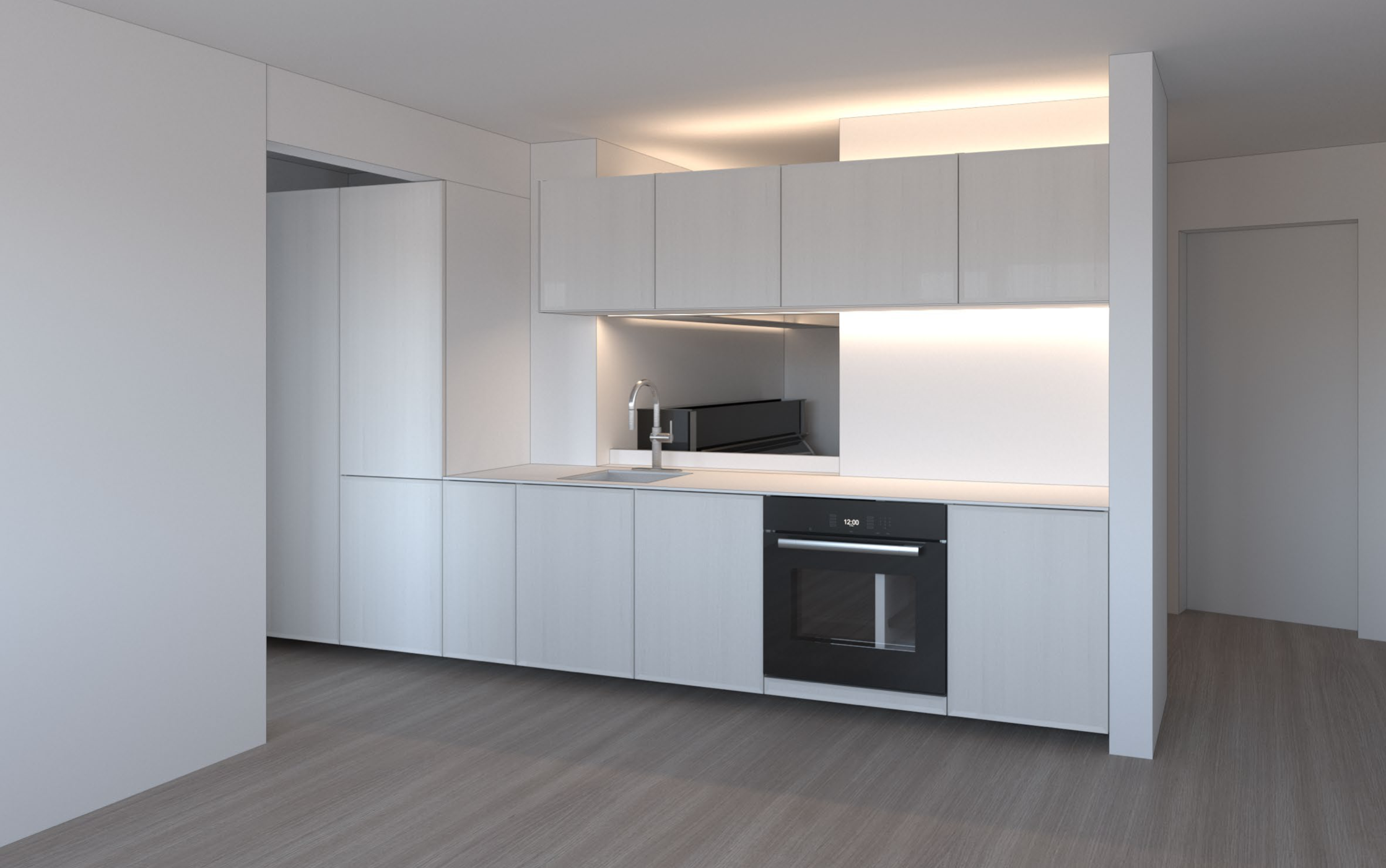
Before spending upwards of $10,000 on something, it’s worth taking the time to see what you’re buying in person. Or at least to the extent possible in current circumstances. If it were easier to travel, I probably would have made a trip down to New York to look at complete kitchens made with Reform’s cabinet system. I’ve chosen to settle for more pandemic-friendly samples.
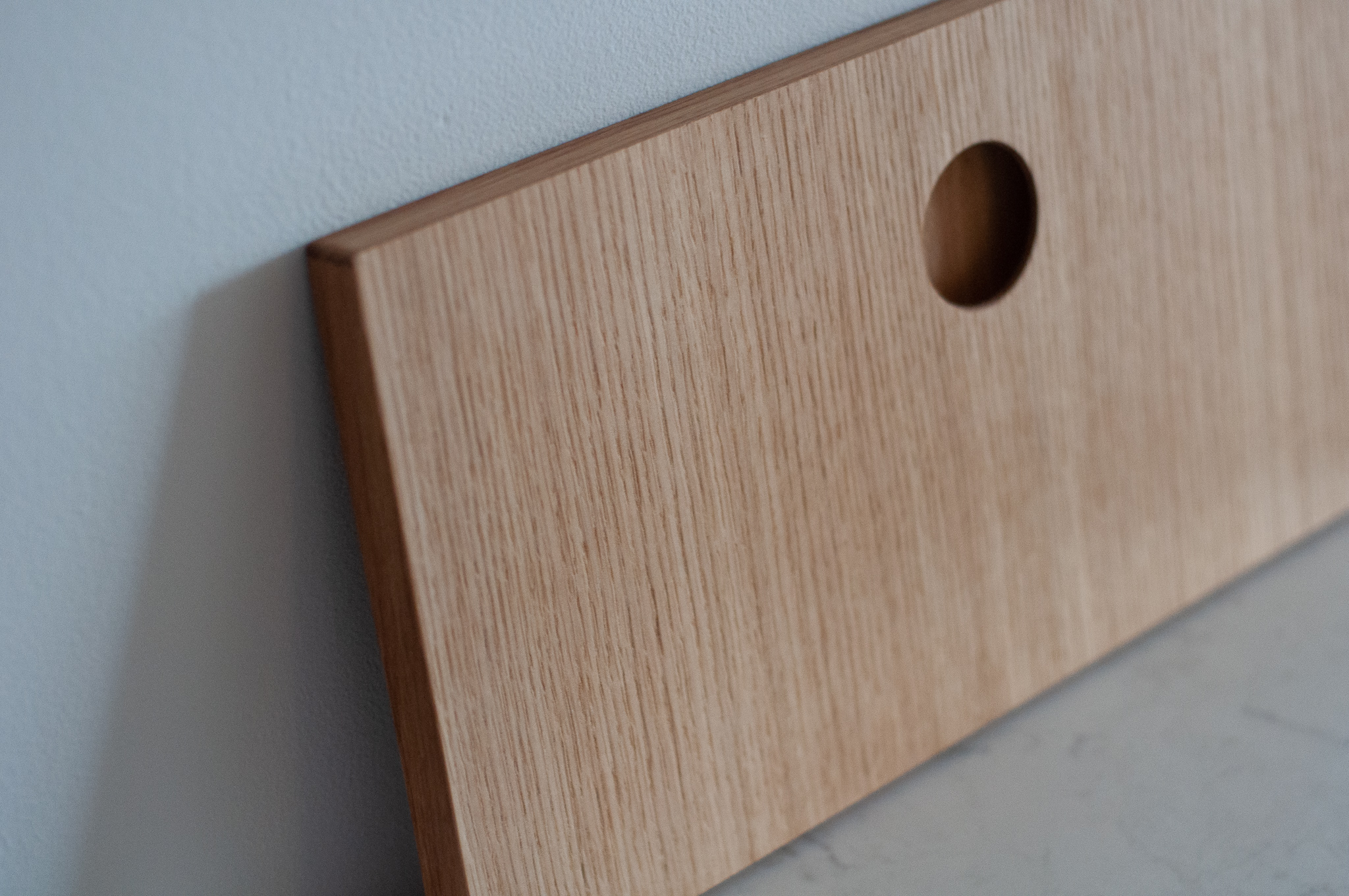
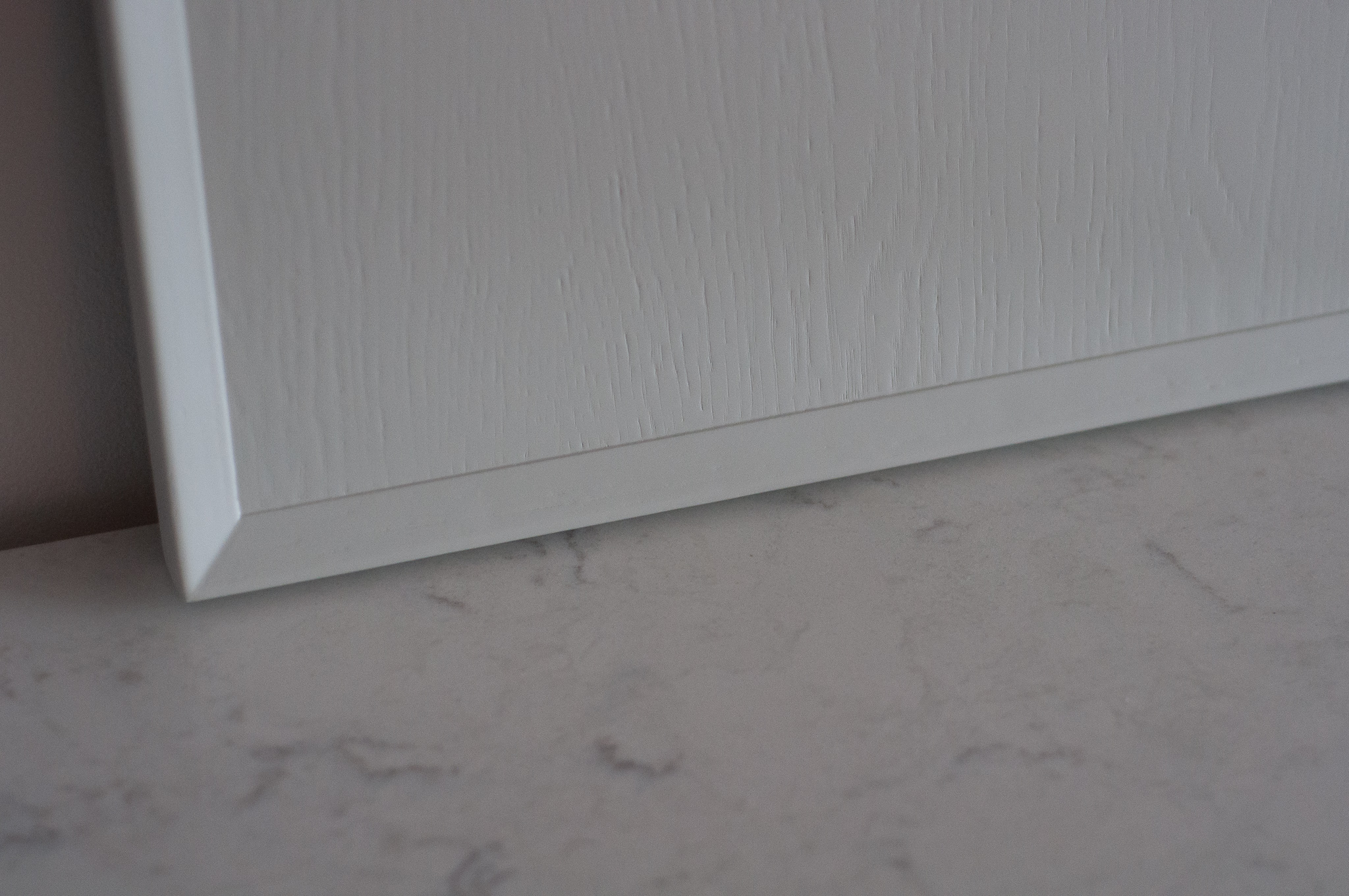
The leading contender was Reform’s “Frame” option in white. Fortunately they had that option in stock as a sample, so I was able to get my hands on that. My architects are also big fans of natural wood, so they also pulled the “Basis” option in oak veneer for me to look at.

I was pleasantly surprised with the oak veneer finish. My inclination is against lots and lots of natural wood. I couldn’t articulate exactly why. But the oak is really quite nice. Certainly much nicer than other oak effect or oak veneers I’ve seen in fancy hotel rooms or other people’s less “designed” kitchens.
I was unpleasantly disappointed by the integrated circular cutout handle. I love the idea of a kitchen without pulls. It’s sleeker, more compact, and presents fewer chances to catch stuff (like a headphone cable or coat). But the integrated pulls on the Basis didn’t float my boat. They’re small and a little uncomfortable. There also wasn’t a ton of attention paid to the feeling of the surface you touch. It feels like bland just-sanded-enough wood. There is no joy.
It looks kind of cool. I could see this being a good option for something other than a kitchen that’s opened less often. Having to deal with that built-in pull every day would drive me crazy.

At any rate, I was already much more inclined to the Frame look painted white. After living with the samples for a few days, I’ve more or less committed to it. It has the whiff of classicism that I like with a bit of a modern twist. Rather than a bog standard shaker look, it evokes it with an edgy angled frame. There’s texture as the wood grain shows through the paint.

I’m still waiting on final pricing for the cabinets. I also need to figure out exactly how I want the drawers and doors configured. Once that’s all set, the order can go in, and the fun really begins. With a provisional delivery date, I can start the planning process (getting approval from my condo board) and pick a contractor.
Feature image credit BOS |UA