Cabinets, Part IV
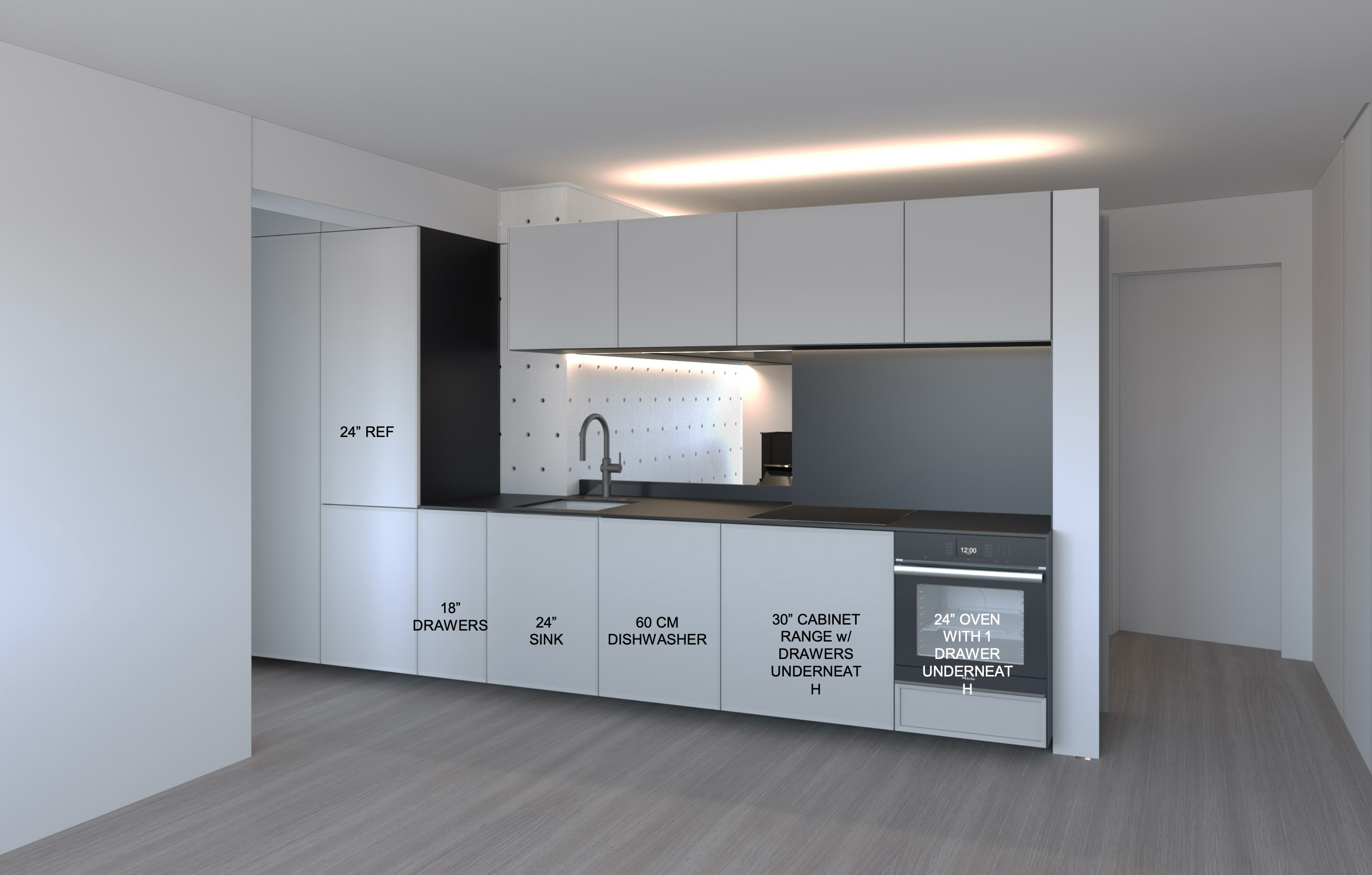
Getting a final specification for the cabinets has been quite a journey. Never would I have guessed it would be so difficult to do something as simple as pick out how to arrange drawers. But after several weeks — plus a break for Christmas and New Year — I have a final layout, down to which drawers go where. There’s also been some interesting back and forth about what to do behind the new kitchen.
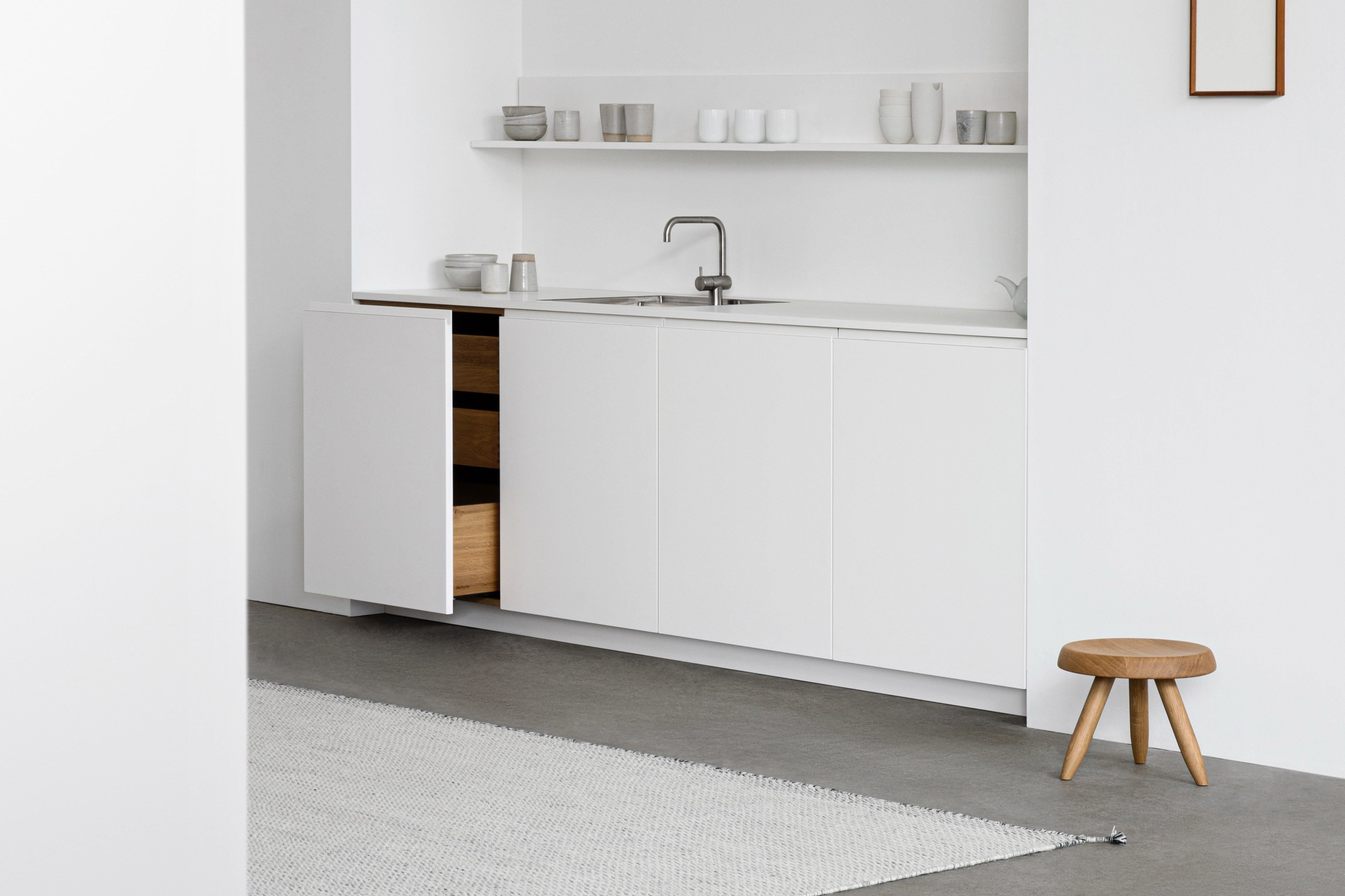
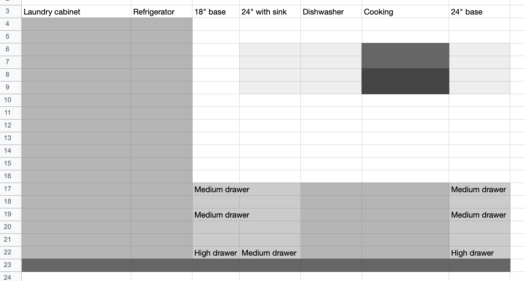
Starting with the cabinet layout, once I had finalized appliances and the general layout I had to get into detail. In particular figuring out how I wanted to arrange the lower cabinets. From the beginning, I’ve been pretty certain that I wanted drawers in the lower cabinets rather than doors with shelves inside. Once you’ve used a kitchen like this, you’ll never go back. I also wanted pull-outs with interior drawers. In some ways it’s a bit more inconvenient, but it looks a bit more streamlined.
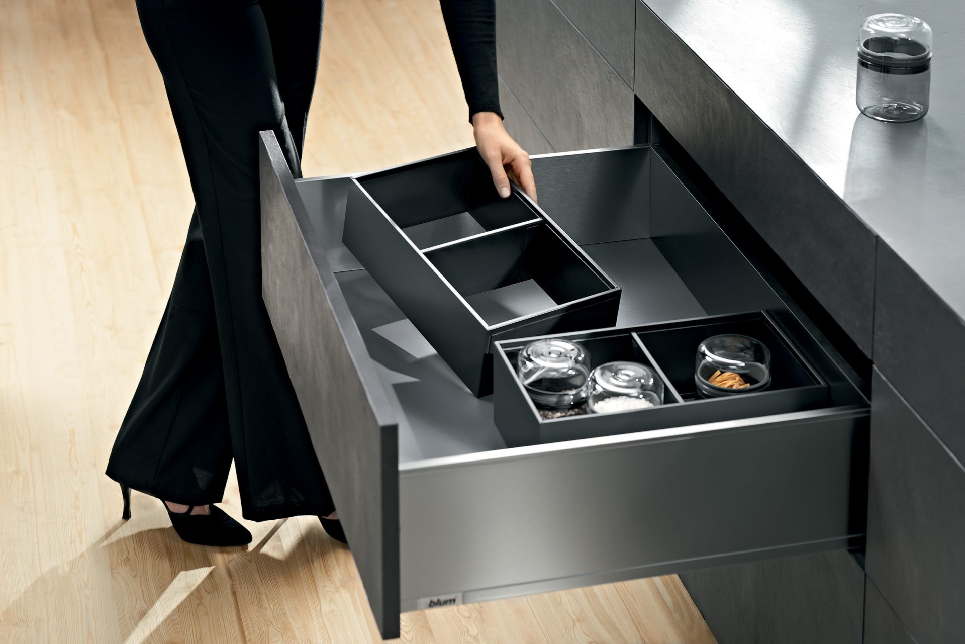
My initial choices for interior drawers turned out not to work. I had too many drawers and the wrong choices for inserts. After much back and forth, I managed to find something that did work. I’m going with Blum’s Legrabox line of drawer boxes that has a corresponding set of organizing inserts, which should be nice.
Unfortunately, someone then realized that even that plan wouldn’t work. Because I’m getting the world’s fanciest German induction cooktop, there wasn’t going to be enough space to stack the oven below the cooktop. One option would’ve been to build out a super-thick worktop, to add height for the cooktop to have enough clearance over the oven. The second — what I went for — was an unexpected windfall, even if there was a slight aesthetic compromise, in the feature image at the top.
I have to admit, the oven sitting on the right like that does look a little awkward. But there are advantages, too. I feel a lot better — given how small the space is — with an international-style 60 cm oven. I’m never going to host 30 people for Thanksgiving here. There isn’t enough space! Having a smaller oven should reduce my energy footprint. Plus, because it’s also a bit shorter than a 30” wall oven, I get a cool drawer under the oven for baking equipment. By sticking storage under the cooktop, I get that extra six inches of space, even if I can’t have a top drawer because of the cooktop’s height. It’s also a happy accident that the smaller oven is about $2,000 cheaper.
The cabinet order still hasn’t gone in. Because of our super fun pandemic, the delivery time has slipped to up to 18 weeks. The final price tag clocks in at about $9,500, though that includes some paneling for the area behind the newly relocated kitchen.
Speaking of, there’s been much more interesting back and forth over the newly created space in the soon-to-be former kitchen.
I’m not exactly sure what to call the space. Maybe I’ve been watching Grand Designs for too long, but I like to think of it as a mini-snug. The idea for now is to stash my piano there, thus freeing up the main living space to compensate for the intrusion of the kitchen there. It’s also a nice opportunity to make the entry to my apartment nicer. As it currently stands, coming inside is very awkward. The door sits at an angle to the walls on either side, and with such a narrow space it almost feels like you’re walking into the wall when you enter. Plus, there isn’t any storage for coats, bags, or shoes.
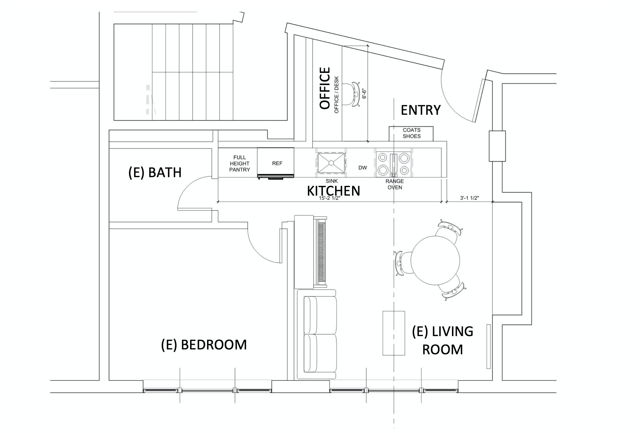
Much of the awkwardness is resolved by tearing out the wall, so there’s ample space when you walk in the door. The storage was a bit more fun to work through.
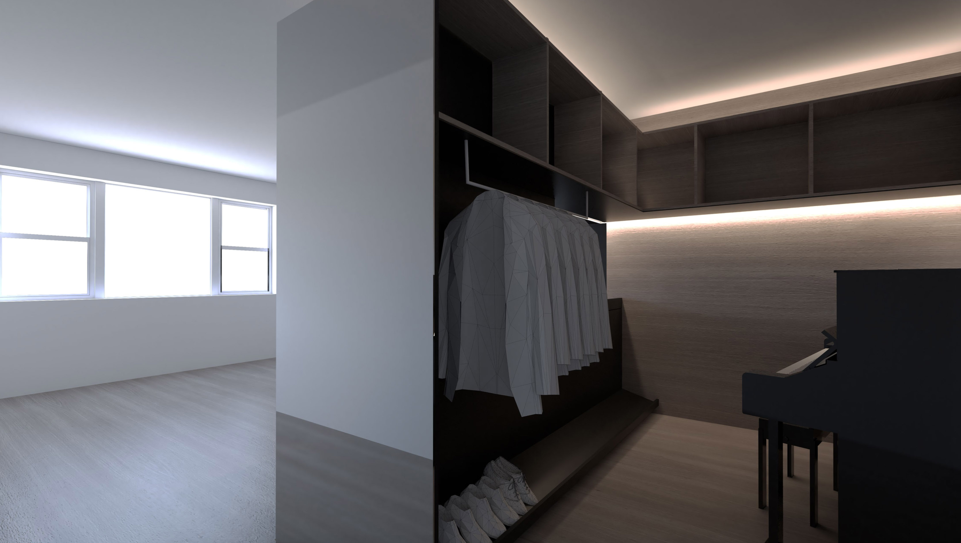
The first concept was what I christened the “luxe Japanese mudroom.” It envisioned wood cladding, lots of upper storage, and what amounted to an open closet. There were a lot of great ideas. It looked very luxe and very sleek without being cold. The architects suggested using Corian for the backing and shoe shelf, which would’ve been very easy to clean. Unfortunately, I don’t have a palatial apartment where it might make sense to devote 70 square feet to an entry vestibule. Even in the render, my piano looks a little bit strange sitting in what’s effectively a closet.
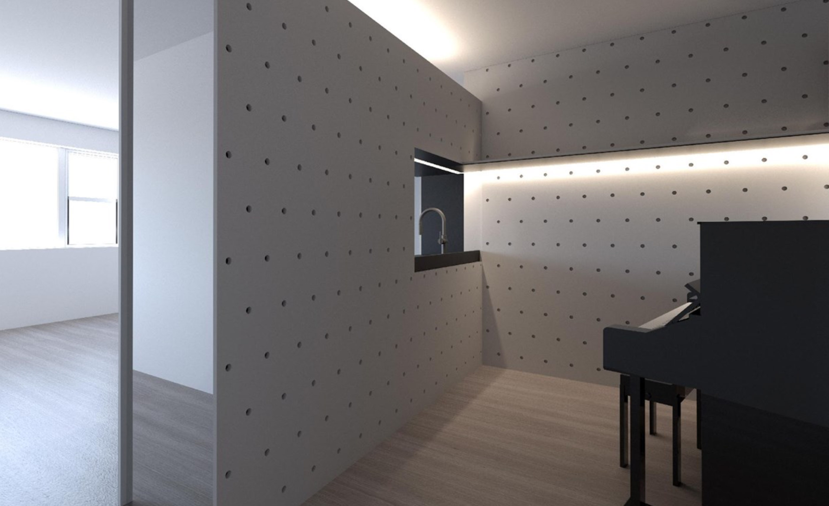
So it was back to the drawing board. I suggested the Opencase system from Henrybuilt, which, while very cool, at around $10,000 for the set I wanted, was a bit outside the budget for this project. My architects came up with a very cool design that echoed that, with a pegboard system potentially wrapping two walls and into the kitchen.
I really love this concept. It adds a bit of whimsy, still ties together with the kitchen — the pegboard will be made from the same material as the kitchen fronts — and gives very flexible storage. It also helps resolve my slight concern over the omission of one wall cabinet in the kitchen area, which my architects thought avoided an awkward joint at the refrigerator. I bought the argument enough to go along, but it was a little sad to give up some precious storage in a space so small. Potentially adding the peg system in the kitchen should make it possible to reclaim that as storage space, if perhaps in a way that cants more towards style than function.
In the next few weeks, the project should really get going. Or at least I suspect I’ll feel that way because I’ll have to start spending serious money. The cabinet order should go in soon, and I’m already looking at ordering the appliances to avoid delays that may exist because of the pandemic’s continued impact. I’ll probably also start getting a sense of the construction costs as we begin looking at contractors to execute.
Next time, there should be more details on the very cool pegboard system, and I’m planning a bit of a “staycation” to visit design showrooms. I need to pick out new flooring and begin to look at materials for the worktops.
Feature image credit BOS |UA